
Proposal
A mobile application that offers a personal and adaptive service for customers to manage their health insurance.

Team: Rebecca Harrington, Carmen Li, Joyce Aquino
Role(s): Quality-control manager + Facilitator
Low-fidelity/high-fidelity mockups, visual + art direction, secondary research, organizing usability sessions, presentation slides
Tools: Adobe Illustrator, Adobe Photoshop, Sketch, Flinto, Keynote
This was a 4 week product proposal.
*Disclaimer: All ideas and solutions are hypothetical. Logos and names have been obscured for privacy and presentation purposes.
View Final Slides
2018 VanUX Awards Finalist
“Most consumers’ experience with their insurance company consists of buying a complicated policy in a vaguely unpleasant underwriting process ... and when something bad happens, filing a claim and hoping it gets paid.”
Defining the Problem
There is a poor correlation with the insurance industry.
Insurance is typically presented as a list of documents loaded with complex terminologies and stale text. People view insurance as a large expense with few visible benefits beyond just having it as a “safety net”. However, being uninsured in critical times can bring about detrimental consequences.
Secondary Research
As students without prior experience with insurance ourselves, we set out to understand the company: their brand values, their competitors and their existing digital interventions. Conducting secondary research through IBM studies and articles online, we learned that the main reason policyholders leave their insurer because their provider failed to keep up with their changing needs. Insurance is no longer a logical sell to the brain, but needs to be connected to emotions.
“41% of policyholders say they have switched their insurer when their needs changed and their provider couldn’t keep up.”
Driving Insights
1. The insurance industry has been slow to progress into the digital realm. With the increase of technology in our daily lives, people's expectations are shifting.
2. The CEO has expressed the need for the company to invest in digital technology in order to improve their customer experience with the growth of insurtech companies.
3. Insurance jargon, a complex claims process and a lack of transparency of the company’s existing mobile application is detracting from their customer experience.

Value Proposition
A focus on fostering and maintaining relationships with younger customers throughout their lifetimes in order to strengthen customer base.
Created for customers aged 25-40.
In Canada, age 25 is when individuals are no longer covered under their parents' benefits. Up to age 40 is when people are more likely to embrace new technology as long as it adds convenience to their lives.
Mapping it Out
In-depth Interview
We interviewed a friend who worked in the insurance industry in order to understand the back-end process and customers’ common concerns. The information helped us create a simple map, showing the touch points in which customers interact with insurance.
Reframing problems as opportunities: "How might we"
... make a large corporation friendly & approachable to customers?
... clarify coverage without sacrificing the fine print?
... help customers feel confident & protected knowing they have purchased the right plan?
... bring reassurance to the customer in times of crisis?
Finding the point of intervention.
Mapping a customer’s journey from awareness (that they need insurance) to the ongoing stage of retention, my team and I decided to focus on the post-incident and claims process. This is the point when customer engagement is high.
I created the information architecture with a focus on the process of submitting a claim and checking on a claim status. This helped inform the key wireframes that I sketched out in low-fidelity. Each team member took turns commenting any questions or concerns using post-it notes.
Prototyping & user-testing
We ran user-testing sessions on 7 participants within the age bracket of 25-40.
I was responsible for preparing an outline of interview questions and tasks we wanted the participants to walk through.
Medium-Fidelity Mockups
Participants thought the documents had to be submitted in order because they were numbered. They were also confused by the checkmark and “x” icons, mistaking the “x” as an error rather than an indication of an incomplete document. Some misunderstood these icons as buttons to click on. After claim submission, participants expressed that they would not take the time to rate the service based on star ratings and did not see a need to chat with an advisor right after submitting a claim.
High-fidelity Mockups
Based on feedback, I iterated on the previous mockups with a focus on bringing clarity and simplicity to the experience.
Copywriting was also defined to provide an instructional/actionable tone, rather than a declarative tone, sprinkled with some friendliness + enthusiasm. When presented with the claim status, there is a focus on addressing the case when a claim is denied with a red notice.
Tying it back to the existing brand values.

Approachable
Making insurance feel less intimidating.
Conveying insurance information through friendly copywriting makes the topic more approachable, leading to trusting relationships with customers.
By providing access to informative definitions that illustrate unfamiliar concepts, the claims process is made more understandable and digestible.

Transparent
Keeping customers informed and involved in the claims process.
Transparency influences loyalty because the customer needs to understand and be comfortable with complex processes.
Providing the claim status reduces ambiguity and confusion by allowing customer to track how far along their claim has progressed, so customers are never left in the dark.
Forward Thinking
Insurance that grows with customers on their ongoing journeys, adapting to customers' changing needs.
One of the main reasons people leave their insurer is because the company doesn't offer solutions when customers' needs change.
Through a questionnaire, we allow customers the opportunity to discover insurance plans that may be more suitable to their changing needs over the course of their life.
Visual design decisions.
Using a story-telling approach to facilitate emotional empathy.
It was important to present the topic of health insurance in a fun and engaging way while bringing out the emotional aspect. I advocated for a scenario video to help the team, as well as our audience, walk-through the insurance claims process. I felt that a method of storytelling would help bring out the reality of insurance in critical times and help the team, as well as the audience, empathize on an emotional level.
The considerations of user error prevention.
Claim denial is a potential major point of frustration for customers, especially in times of crisis or urgency. It is important to ensure accurate information before the customer submits the claim.
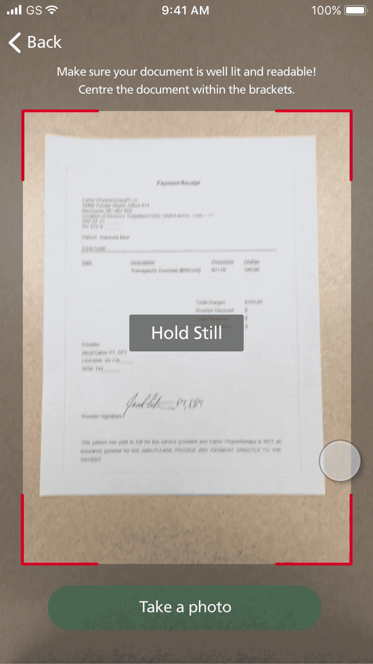
Camera guidance that helps improve the accuracy of scans, to ensure that the quality of the photo is maintained.
Verification of scanned information to accommodate for errors, for the times when technology isn't the most accurate.
Approaching the inevitable reality of a claim denial.
Although we can’t control the emotional reaction to a denial, we can be as open and informative as possible in order to minimize confusion and misunderstandings.

To be transparent, using simple and neutral language, explaining why and at what stage they were denied.

To be forward thinking, providing call-to-actions for seeking help, helping customers feel like a denied claim is not the end of the road.
Reflection
Identifying the constraints.
We chose to limit the scope to health insurance because it carries a more emotional and recurring nature (as opposed to home/car insurance). Perceived self-worth: cars and home repairs can be costly, but our state of health is detrimental in the long-run.
Due to the inability to anticipate an accident or health emergency, we recognize that the user-testing participants in our study were not in a true state of emotional stress or anxiety. Thus, this consideration may have impacted or limited the results and feedback received.
Making it a frictionless experience is desirable enough.
Originally we had implemented another feature in attempt to provide a differentiation factor from other insurance companies. We fell into the trap thinking that the increase of customer app opens translates to customer loyalty. The attempt to differentiate appeared like just tacking on another feature to make our product different. As a team, we learned to re-orient ourselves and let go of ideas that may not be bringing real value to customers.