
A proposed website redesign for Big Room Inc. to increase their domain sales.
Team: Marni Robinson, David Hirtle, Owen Rogers
Role: Project Manager, Prototyping, Wire Framing, User-Testing
Tools: Asana, Realtime Board, Adobe Illustrator, Sketch, InVision, Flinto, Look Back
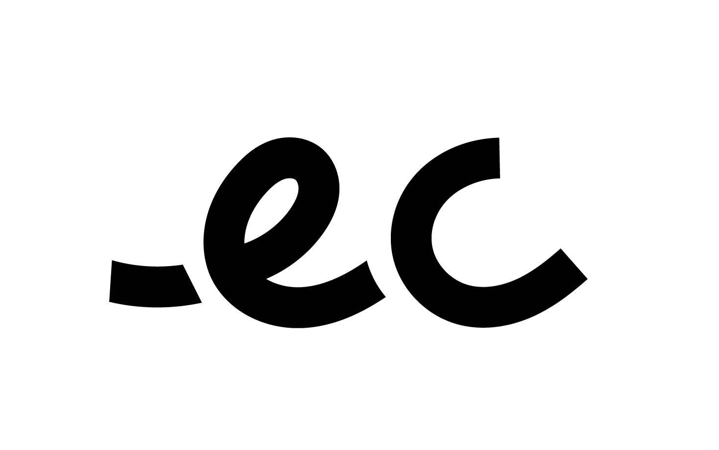
“.eco is a dedicated web address ending for businesses, organizations and individuals committed to positive change for the planet.”
Re-directing the focus.
With the launch of the .eco domain name in April 2017, the team collectively created a simple landing page (www.get.eco) as our sales/commercial-focused site. After our launch of the .eco domain name, we were surprised to find that nearly 50% of our source of sales were actually coming from our site, www.home.eco, that was only intended to tell our story and provide resources.
This led the team to re-direct our focus on enhancing the home.eco website in order to increase our sales. A UX design process was never used to develop the existing home.eco site, so I was put in place to manage a complete revision of home.eco in the post-launch period.

In seeing the need to re-direct our focus of home.eco from getting registrars onboard to gaining customers, we had to step back and start with the basic questions:
Who is home.eco for?
What are people using it for?
How does it play a role in obtaining a .eco domain name?
Should we consider consolidating our sales site (www.get.eco) and our main site (www.home.eco)?
Planning it out

I was responsible for managing this project while also taking on the role as the UX/UI designer.
The first step I had to take was to create a tentative timeline and schedule to ensure the project meets the 2 month deadline. My partner and I brainstormed our next steps to take and how we would achieve these steps. Before jumping into the design, a team meeting had to be called to collectively answer/discuss basic questions to determine what type of users we are targeting and tasks they are trying to achieve on www.home.eco.
Currently, we average 8 .eco domain names sold per day.
Our business goal - To sell 15 .eco domain names per day by Thanksgiving.
Identification - Defining the issues
View my presentation slides
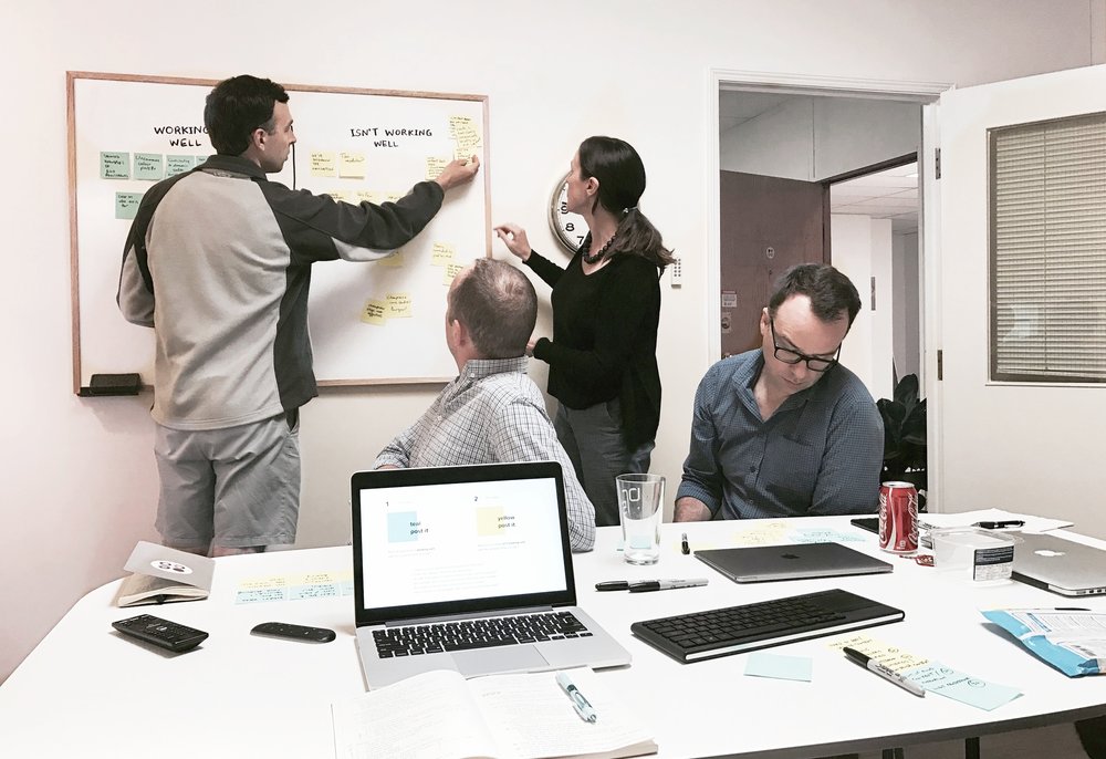
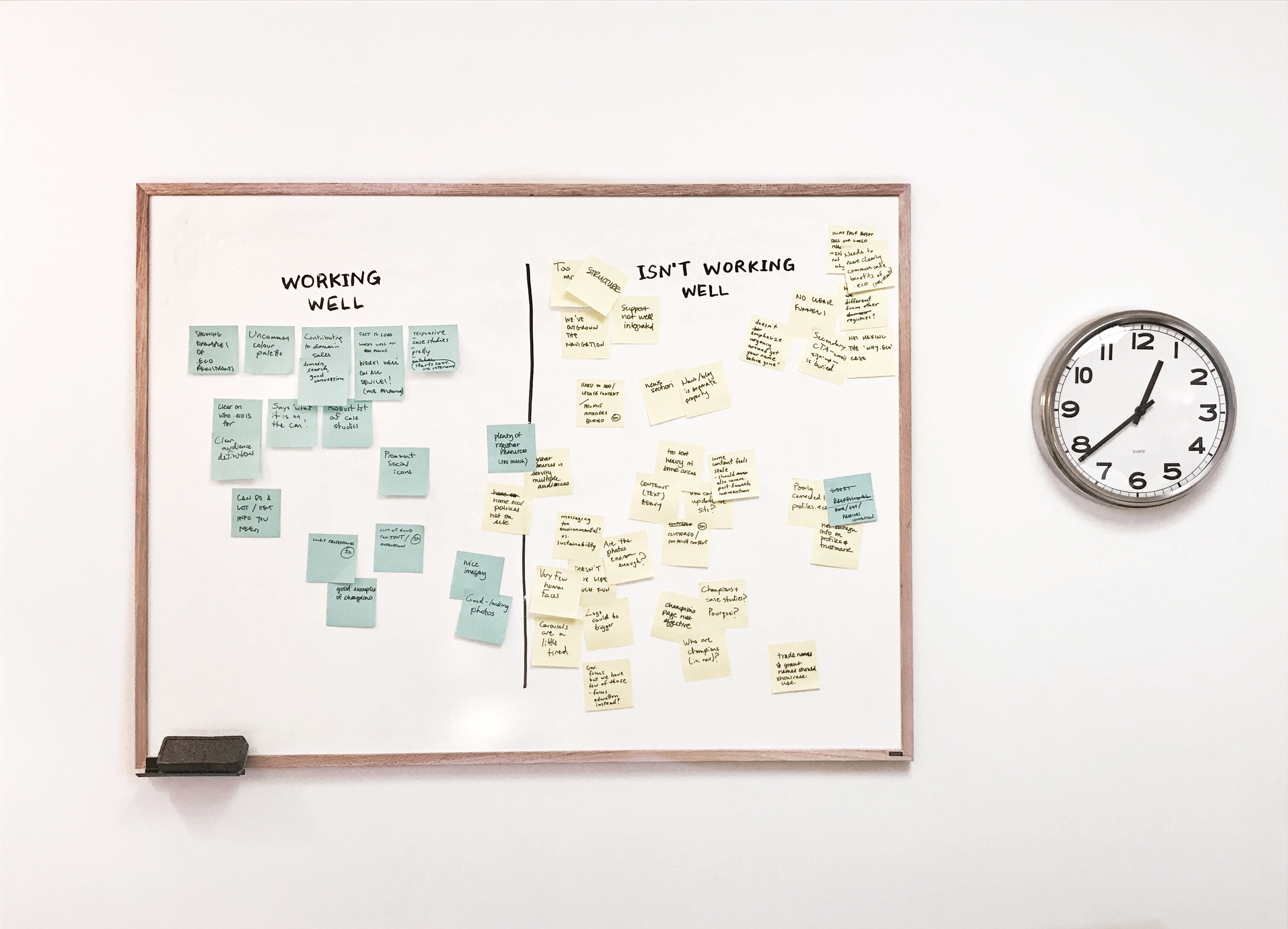
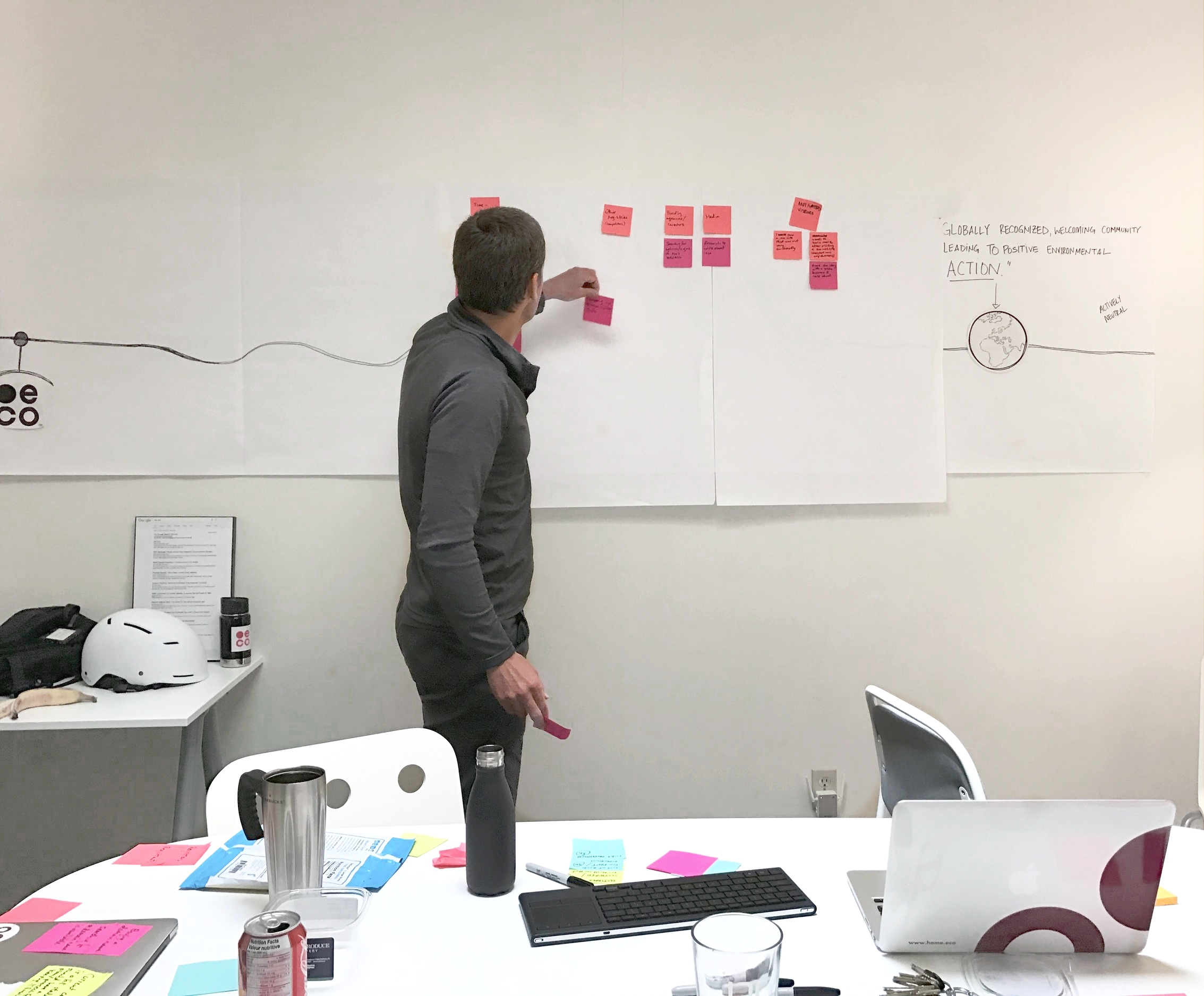
In a week's time, I planned and facilitated a workshop meeting with the Big Room team. Using a card-sorting method, we discussed the current state of the home.eco site that helped to pin-point the most important issues: an outgrown navigation that had no clear funnels, a too content-heavy homepage that doesn't communicate our benefits in a clear and concise manner and stale content from our initial launch period that doesn't communicate our post-launch momentum.
We were also able to discuss possible types of users who would visit home.eco and that tasks they would try to do on this site, our main focus targeting individuals who are most likely to purchase a .eco domain (tire-kickers) and motivated visitors who may not purchase a .eco domain but are curious.
Testing the Interface
Within the next week, I was able to reach out to 7 individuals to perform usability sessions on in the office. In preparation for the user tests, I set reminders for myself to email the participants of their scheduled slot the day before and did a practice run-through with my colleague. During the sessions, I took on the role of being the facilitator while another colleague helped me take notes.
Half of the participants had never visited the home.eco website and had almost no familiarity with what we do, while the other half had a better understanding and experience of domain name extensions.

Above: the testing environment. The participant would be facing away from the board so there would be less distractions. A mouse was provided in the case they aren’t familiar/comfortable using the MacBook trackpad. I facilitated and interacted with the participant while a colleague helped me take notes during the session.
Analyzing the Findings

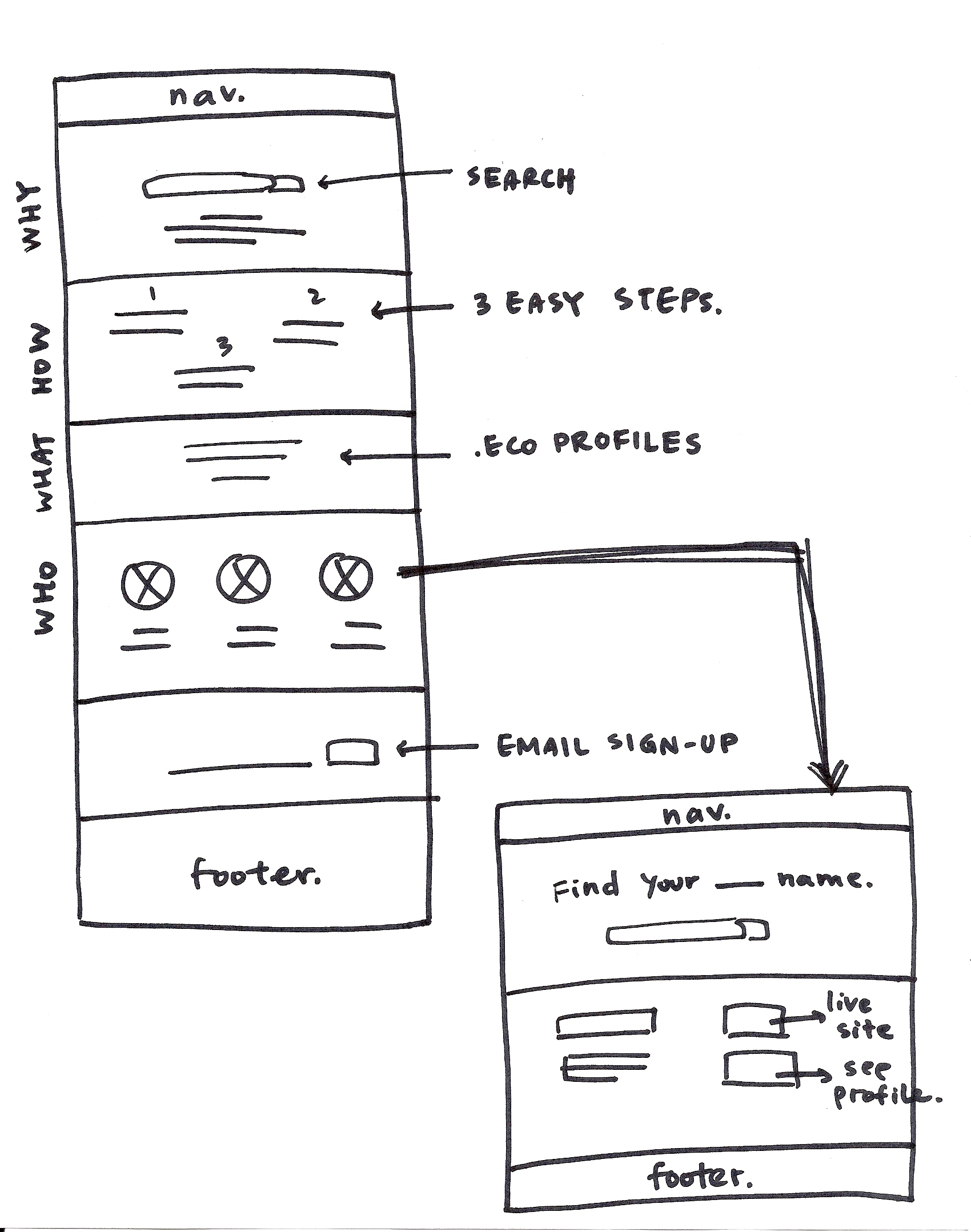
Navigation bar on www.home.eco

Navigation bar on www.profiles.eco
One of the biggest pain points we noticed was that users were lost and confused navigating between www.home.eco and www.profiles.eco.
The team had wanted to maintain a consistent design of the navigation bar between the two websites to create a seamless transition/experience for users, but in fact, through user testing we discovered that the 'seamless' navigation bar was causing users to not be aware that they had navigated to a different website. Users were confused because it had seemed like they had "lost their navigation".
We also found that using an unfamiliar term, "Registrars" causes a sense of intimidation, confusion and frustration for the users who have never bought a domain name and ultimately led them to click away and leave the process of purchasing a domain name.

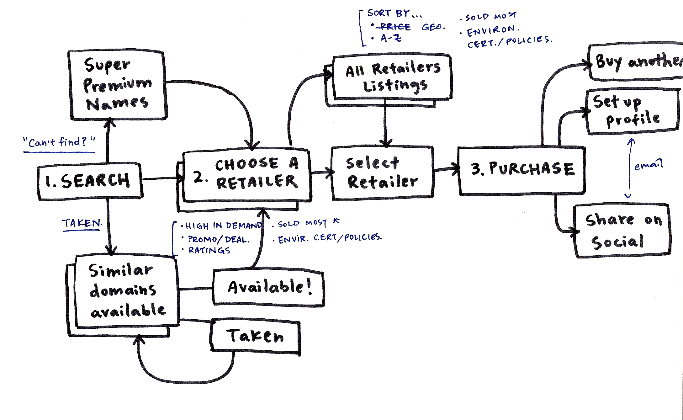
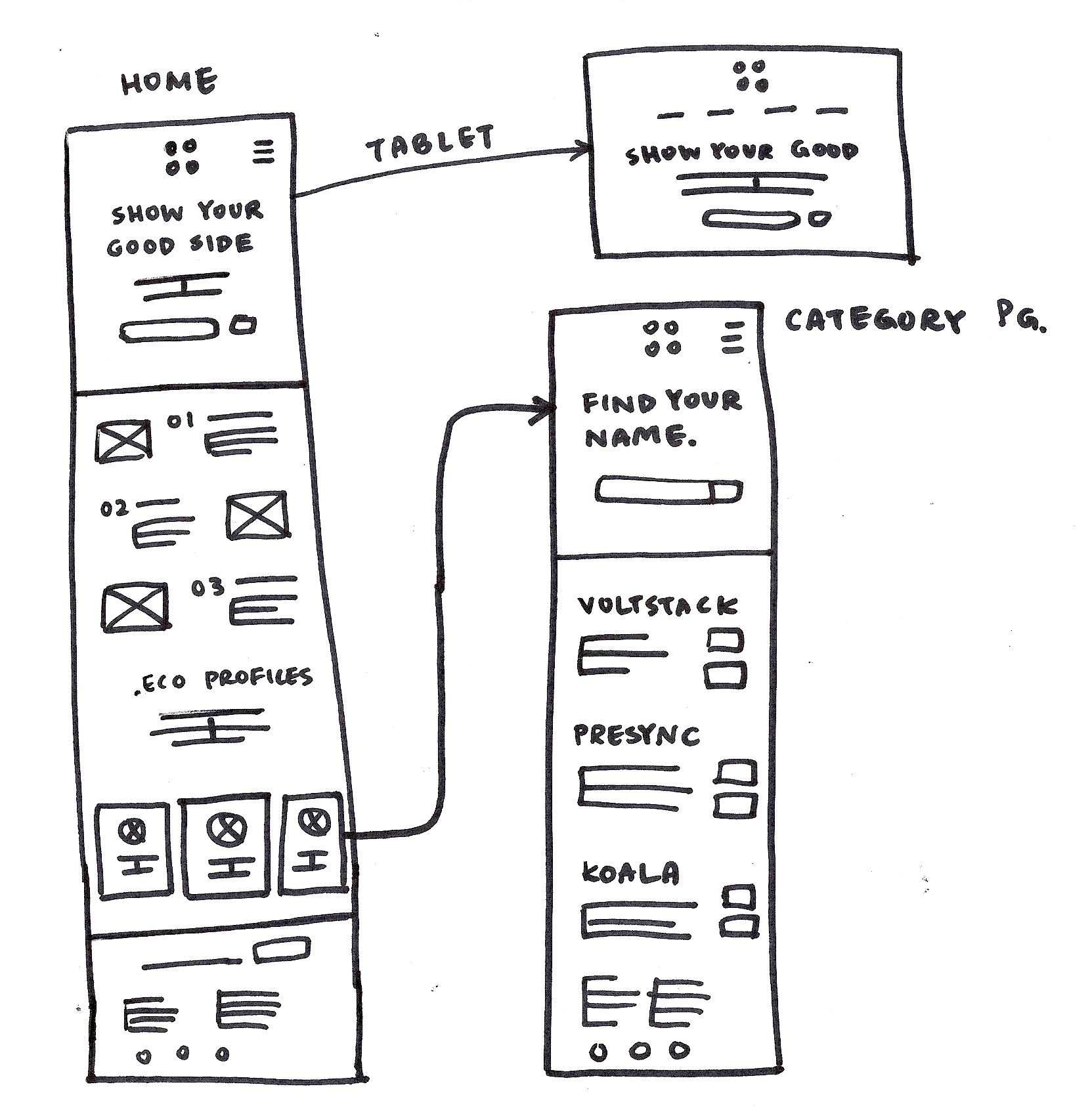
User Flow + Wire Framing
Going through and creating a user flow for how a user buys a domain through www.home.eco, I was able to begin to create low-fidelity wire frames to lay out to the team before I began digitizing them into mock ups.
One of the design solutions for users who weren't aware they were navigating off the home.eco site based on our usability sessions was to implement buttons that explicitly tell users where they are going by labelling "See more on profiles.eco".
Mockups + Prototyping


Looking back on it.
Because of our tight timeline, we had been able to recruit our tire-kickers (potential customers) to run user tests on but did not get the chance of testing registrars/retailers. I would have also liked to run additional tests on the redesigned wireframes/prototypes to see if the best decisions were being made and to continue to refine aspects of the site that may not have been working as well as we had thought.
Although the deadline was tight and at times were stressful managing a project, I learned to constantly take notes during/after discussions and take initiative of facilitating/organizing meetings and speaking up by asking for help or questions whenever I needed guidance or clarification. In the beginning, I was overwhelmed with the idea of taking on a project in a professional working environment but over the past few months I have grown more comfortable contributing ideas and raising questions that has introduced new ideas.
Working in a small start-up environment where everything is fast-paced and everyone plays a crucial role, I realize how important it is to keep myself on track throughout the week by jotting down to-do lists every morning. I had the opportunity to wear many different hats throughout this experience, taking on many tasks and learning that every suggestion/opinion is valued in a team.